
Often overlooked or undervalued as part of a development setup outside of Powerline and Oh My Zsh users. Choosing appropriate fonts and font features can help improve your development experience without a significant time investment. These characteristics are what I consider the most important outside of size, weight (bold/italic) and colours when evaluating a font.
Monospace fonts
One of the most important characteristics for a development font is that it is monospaced, this ensures all characters have the same width as each other.
Monospace VS Proportional (Image from Wikimedia)
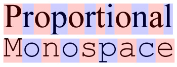
Using a monospaced font can help to improve readability and reduce eye strain as well as ensuring consistent alignment of code from line to line. Default fonts within development focused applications such as VS Code will often be monospaced however it is less common in general applications. When choosing a new font this should be requirement for anyone who reads or writes text content regularly.
Ligatures
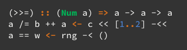
A Typographic Ligatures is the visual combination of two adjacent characters into a single character. They allow common character combinations to be represented as a unique symbol without changing the underlying letters. Take the => characters for example in the images below.
Without Ligatures (Image from i-tu/Hasklig)
With Ligatures (Image from i-tu/Hasklig)
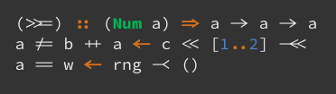
The choice to use is often personal preference for many with some people finding them harder to read and other people swearing by their benefits. They are most helpful when working with functional programming languages, as the symbols will more closely match maths notation common in textbooks and research papers.
Symbol Patched fonts
While less important for text editors or IDE’s using a font with additional symbol support can enable additional graphical features in programs you already use.
Often not suitable as web due to their size fonts patched with symbol support can add from 1 to 1000+ additional characters into a font. These additional symbols can be used by theme or application designers to improve user experiences in traditionally text only applications such as terminal emulators.
ZSH Theme using Powerline symbols
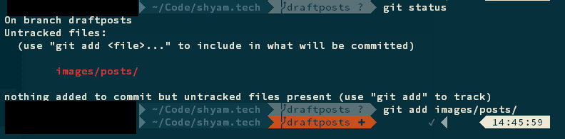
The most common symbol addition for development is the Powerline symbol pack adding between 7 and 30 symbols. This is commonly used to add extra visual information to VIM or terminals allowing easily readable symbols to represent various statuses as seen above with git.
How to start?
- Download Hasklig (or a font with the fature you want) and install it on your computer. Windows / Mac / Linux
- Change your editor / terminal setting to use Hasklig
- Change your other editors, consistency is nice 👍
References
- Hasklig - Great font has all features discussed
- FiraCode - Great monospaced font with ligatures
- Nerd Fonts - Massive List of patched fonts
- The Ergonomics of Computer Code